A Deep Dive Into Our Powerful Theming Engine for Android Automotive
Mar 26, 2024
Casper Kessels
SnappOS is an Android Automotive infotainment system aimed at carmakers from low-budget micro-mobility to high-end sports cars. For each brand, we ensure that the user experience is bespoke and that no two instances of SnappOS will look alike. That is why we’ve designed SnappOS to be as customizable as possible. There are three levels: hardware layout, services, and most importantly, the UI theme.

Hardware Layout
No two interiors are the same. We’ve designed SnappOS so that it can be easily adapted to each different screen layout and dashboard configuration without breaking the architecture of the system.
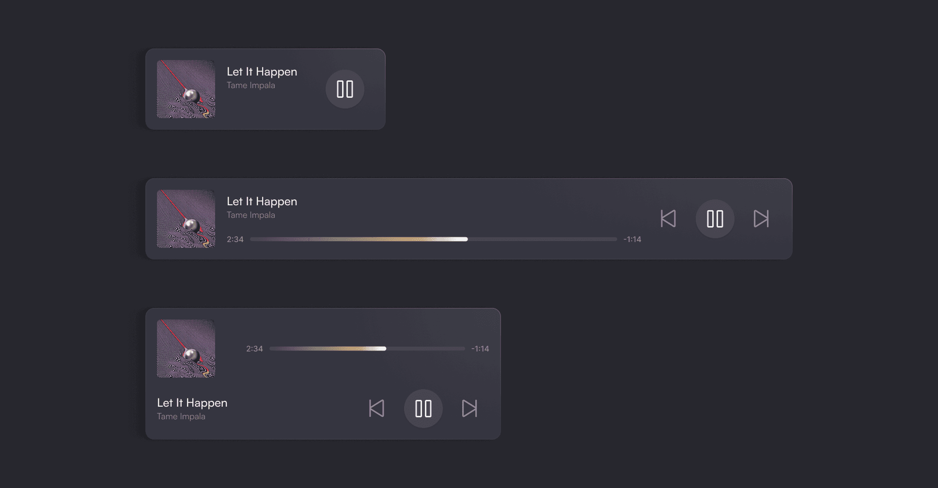
SnappOS supports the instrument cluster, head unit, and passenger displays. For each, we designed a modular architecture that makes it easy to adapt to different screen sizes and feature sets.
To achieve this, we always design for the smallest display size possible so upscaling is easy. We also test all of our designs on different screen layouts, from narrow vertical ones to widescreen. Then, for each of the important components of the launcher, we created different versions to fit the different display sizes so we can build up the UI with these Lego blocks.
We can then easily adapt to specific features. For example, physical or touch-based climate controls.
Services
Next up are the third-party services. Any Android Automotive services work in SnappOS. But it depends on the type of carmaker what strategy is best. We see three different approaches:
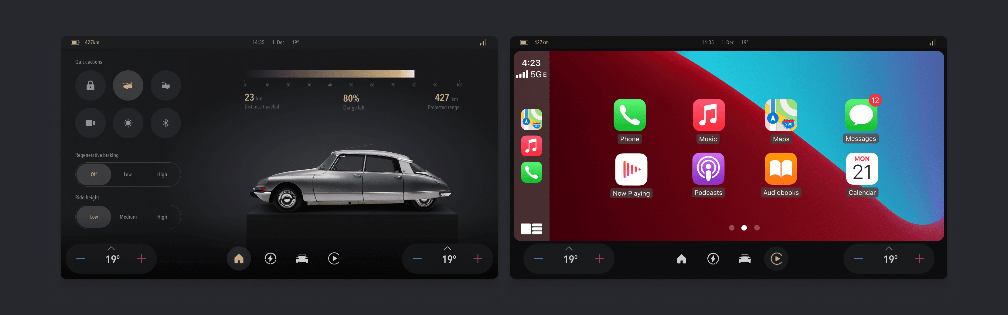
Hand over most of the services to Apple CarPlay and Android Auto, for which we have designed SnappOS Light
Supply SnappOS with a set of pre-installed system apps
Integrate an app store. Since we follow Android’s guidelines, SnappOS can handle both Google Automotive Services and alternatives.
UI Customization
The last layer is the most fun. We’ve developed our own theming engine that can handle the most elaborate UI changes and we set up a fast development process around this. This means that we can go from nothing to a deployed unique theme in two weeks.
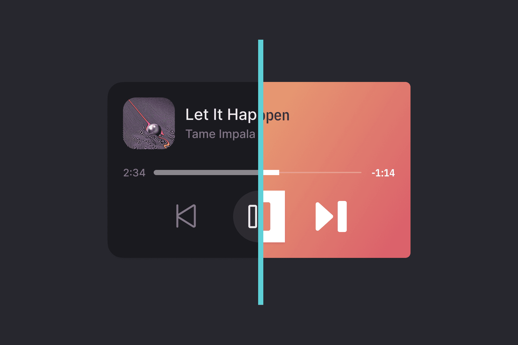
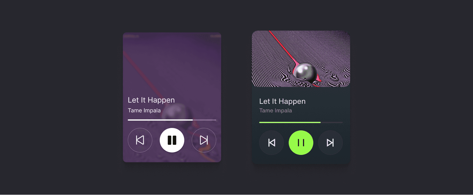
The most important part of the theming engine is that everything from the apps down to the SystemUI is built with JetPack Compose. JetPack Compose is Android’s recommended toolkit for building UI and it makes development easier and faster. It also allows for cool stuff like dynamic changes of the UI theme without losing the state of the system:
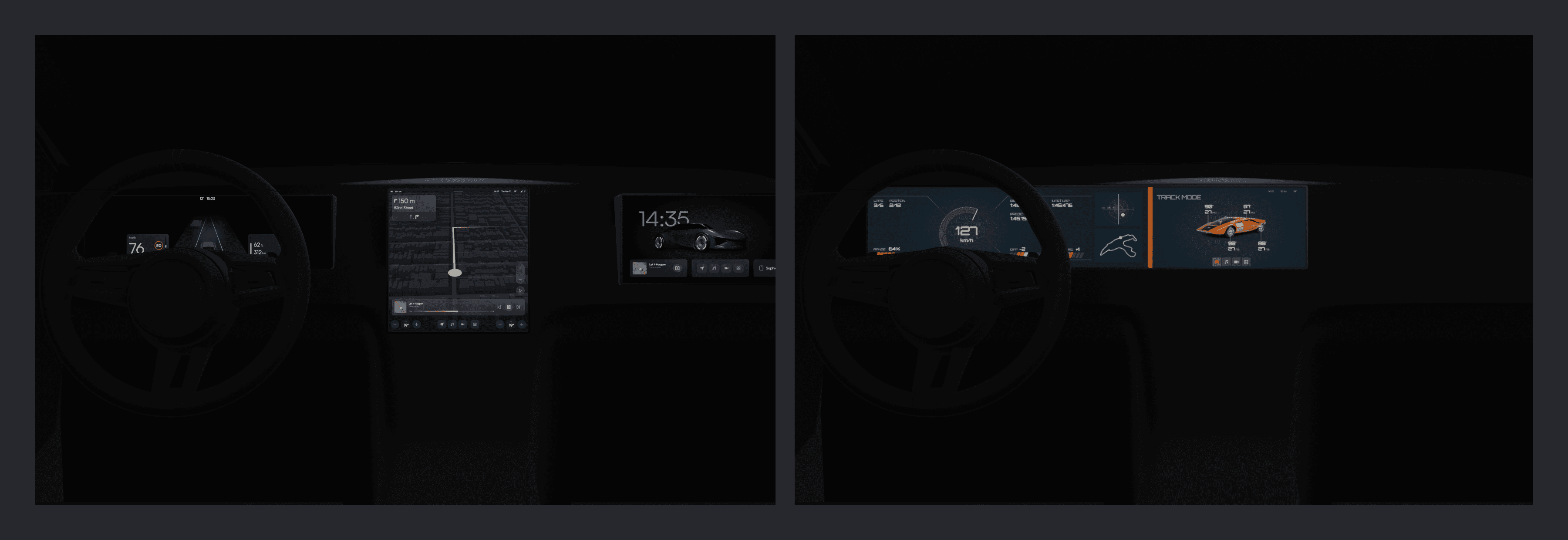
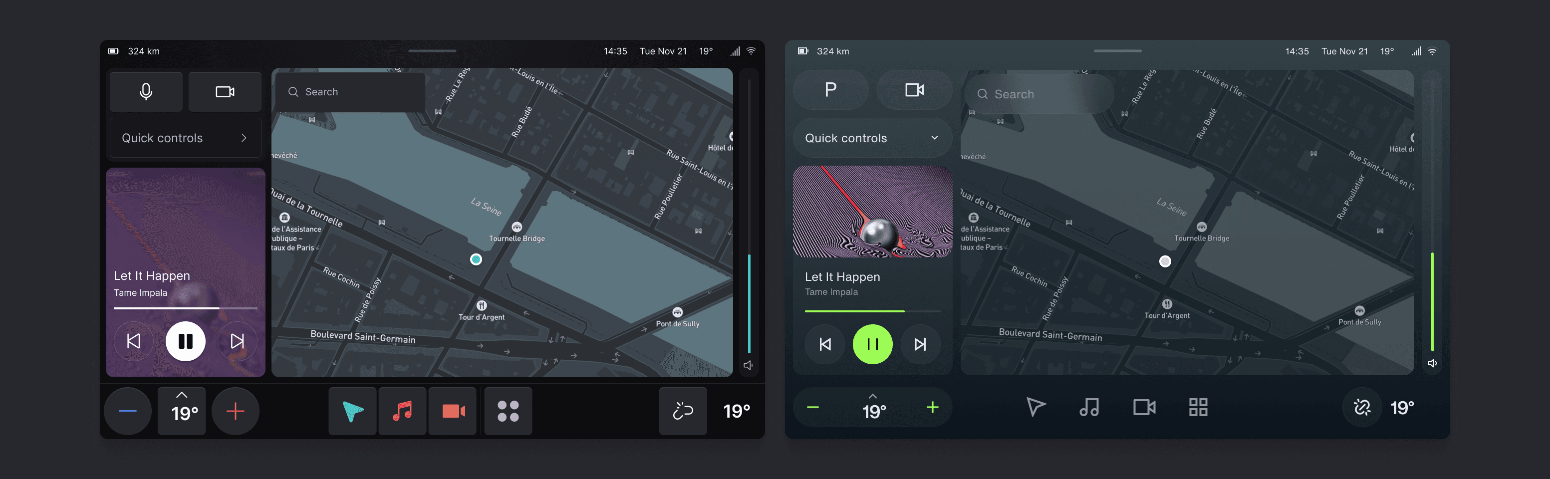
Or seamlessly changing the UI depending on the drive mode:

A lot of work went into creating a design system. Thanks to the newly released variables in Figma we’ve been able to create an incredibly powerful library of components that allows for nearly limitless design changes with minimal work. These components are then built with JetPack Compose. We make sure that our Android and Figma libraries are perfectly in sync and that components are built in exactly the same way. In the next article, we will dive deeper into how we set up our Figma file, but at the core is the list of tokens we define. Each component has a set of unique tokens and by changing the value of these tokens, we can change the look and feel of the entire UI theme.
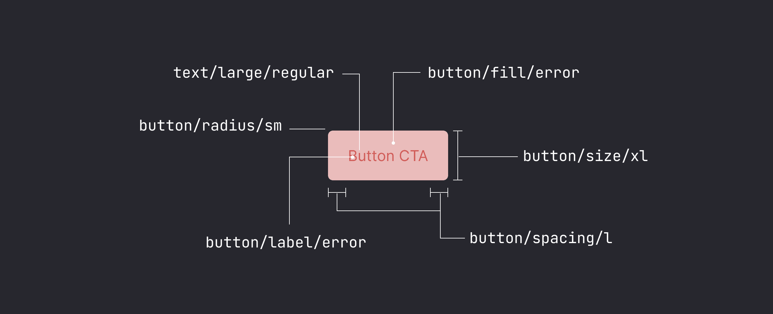
So the process for creating a new UI theme is essentially to change the values of the tokens for colors, spacing, radius, effects, and more. Our theming engine supports more advanced logic than Figma currently supports. For example, we can pass a boolean with each component to toggle a shadow, or we can use a set of boolean and text tokens to create more advanced, custom layouts that are currently not supported by Figma (at least in an automated way, we do it by hand). In the end, we have a long list of tokens that can easily be exported from Figma as a JSON and adapted to code.
But that is not where it ends. We found that there is a small subset of components that heavily influence the look of the system. For example, in our launcher, the media player and menu bar weren’t different enough. That is why we have a set of ‘custom components’ that we adapt for each theme to have a bigger distinction.
All of the components of a theme are captured in an APK. We’ve set up our theming system in such a way we can remotely push themes to devices in the field without the need for major updates. This allows for a whole range of new opportunities, for example, to make themes unique to a vehicle and allow a customer to specify things like colors in the purchase process just like for other aspects of the car’s interior.
A lot of work has gone into our theming engine. And the result is that we can design and deploy totally different looking instances of SnappOS in a matter of days. We can ensure that any carmaker we work with can express their brand properly and offer a bespoke experience.
Next, we will share more about how we’ve set up our Figma file structure and design system to allow for rapid design. And then we will share a use case of where we designed and deployed a unique UI theme in less than two weeks. Sign up below if you'd like to be notified when we post these articles!